As you may already know, our most recent release includes a new DropDownButton widget - an action button that activates a drop-down menu when clicked.

At first glance, this new DropDownButton may seem similar to our existing SelectBox widget. However, SelectBox is an editor with different visual elements.
You can use the new DevExtreme DropDownButton widget across multiple usage scenarios, including:
Simple Drop-Down Menu
The most common usage scenario for this widget is to create a simple dropdown menu that can be activated with a button click. While the SelectBox can be used for this as well, it is designed for selection and not for navigation or actions (SelectBox requires that you add a field template with two additional icons). DropDownButton includes this usage scenario out-of-the-box:
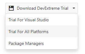
Create a simple drop-down menu with a few lines of code:
$(“#dropDownButton”).dxDropDownButton({
 text: “Download DevExtreme Trial”,
 icon: “save”,
 items: ["Trial For Visual Studio", "Trial For All Platforms", "Package Managers"],
  onItemClick: function(e){
   // perform your actions on item click
  }
});
Split Button
Another popular scenario for the DropDownButton is to use it for split or separated buttons: the first for an immediate action and the second to open/close the widget. For example, the main button can link to a user’s profile page and the second can be used to activate a menu with pre-defined options.
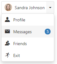
Use the following code to implement split buttons:
$(“#dropDownButton”).dxDropDownButton({
       items: [
          {id: 1, name: "Profile", icon: "user"},
          {id: 4, name: "Messages", icon: "email", badge: "5"},
          {id: 2, name: "Friends", icon: "group"},
          {id: 3, name: "Exit", icon: "runner"}
      ],
       splitButton: true,
       onButtonClick: function(e){
           DevExpress.ui.notify("Go to " + e.component.option("text") + "'s profile", "success", 600);
       },
       onItemClick: function(e){
           DevExpress.ui.notify(e.itemData.name, "success", 600);
       },
       text: "Sandra Johnson",
       icon: "images/gym/coach-woman.png",
       displayExpr: "name",
       keyExpr: "id",
       useSelectMode: false
});With Custom Templates
SelectBox does not allow you to use custom content within its popup but DropDownButton does. This feature will help you create such things as custom color pickers or to place multiple widgets inside dropdown content. Use the dropDownContentTemplate if you wish to employ custom styles that differ from those we ship with the widget. If your widget contains a list, you can use an itemTemplate. This option will save you time since you need not fully customize content.

Embed in ToolBar
DropDownButton can be easily inserted into a ToolBar (use the “text” stylingMode for this purpose). See our online demo for more information on this option.
DataSource Support
Though it’s not a common usage scenario for a DropDownButton widget, you can load items from a remote data storage via the widget’s dataSource option. Our widget supports all DevExtreme data stores and works well with asynchronous data.
Test It Today
If you would like to test-drive this feature, use our npm package:
npm install --save devextreme@19.1
What do you think?
Please tell us what you think about this new widget and what additional functionality you require.
Watch the Webinar
To learn more about all JavaScript related features introduced in our v19.1 release, please watch our "New in v19.1 - DevExtreme HTML / JS Controls" webinar.