Here it is: the fifth part of our What You May Have Missed series for WinForms developers. Once more we have collected several items that may be new to you.
In case you haven’t seen the previous posts of the series, here is an overview:
- What you may have missed - Part 1
- What you may have missed - Part 2
- What you may have missed - Part 3
- What you may have missed - Part 4
Other Tips & Tricks blog posts:
Reset the BarItem Delete Confirmation dialog
When you press the Del key to remove a selected item link from a Bar Manager or Ribbon Control, a confirmation dialog pops up. It asks you to confirm how you would like to remove the element: just that particular link (leaving the source item and any other links intact), or the source item with all of its links.

The dialog includes a checkbox Do not ask me next time, which is obviously useful if you need to repeat the operation. However, you may also regret checking the option when you’re no longer offered a choice when you use the Del key next time. To get the dialog back, find the key HKEY_CURRENT_USER\Software\Developer Express\Designer\XtraBars\ShowBarElementDeletionConfirmation and set it to True.
In the future, we may add an option for this purpose to the dialog Change Design-Time Settings, which you can bring up from the DevExpress menu in Visual Studio. Please let us know in the comments whether you would like to see this happen sooner rather than later.
WindowsUI Button Panel Customization
If you use the WindowsUI View for the Document Manager component, you are probably familiar with the WindowsUI Button Panel. It is a panel with flat round buttons that can be configured as regular push buttons or check buttons. In addition, the panel offers flexible customization options.
Buttons Without Borders
For starters, try turning the property UseButtonBackgroundImages off to remove the default circular borders. Also turn off AllowGlyphSkinning if you use vector icons. The appearance in this configuration may remind you of a flat-style toolbar:

On the other hand, it can look completely different:

Note: In case you play along and notice at this point that the buttons don’t seem to visually react to the mouse, please read on for a solution in the section No Borders And Custom States.
Using the property ImageOptions.Glyph you can assign an image collection to each button. Up to five images are supported to represent the states Normal, Hovered, Pressed, Checked, and Disabled. You can use completely independent icons for all states, and the property ImageSize on the DevExpress Image Collection specifies how big your button will appear. In the animation below, buttons use an SvgImageCollection with IconSize set to 64x64.

Custom Backgrounds
A similar mechanism can be used for background images. Assign an image collection to the panel property ButtonBackgroundImages and you can have buttons with any border shape you like, instead of the default circles.

By combining these features you can create completely unique buttons. Here is a panel that uses both custom background shapes and button glyph collections.

No Borders And Custom States
If you do your own tests with borderless buttons and custom glyphs, you may notice that the Button Panel doesn’t show any reactions to mouse actions if AllowGlyphSkinning is off. This happens because there is no background to indicate the state change. You can try to switch AllowGlyphSkinning on and configure ForeColors for Hovered and Pressed states, but then the custom colors will change the icons.
Here is a setup that avoids this problem. AllowGlyphSkinning is off and the background image collection has three images. One is a completely transparent square (that’s the Normal state), the other two are filled black at 30% opacity (for the Hovered and Pressed states). ForeColor values for the Hovered and Pressed states have been configured to Gray and DeepSkyBlue. The animation shows the result: borderless buttons with custom visual states for the background, and icons that don’t change with the states.

Integrating With Other Controls
Finally, a WindowsUI Button Panel can be used as a navigation element for TileControl, TileBar, NavigationFrame and ImageSlider controls. The panel looks at the number of child items in the target control and calculates how many “pages” are required to show them all. It then displays a corresponding number of buttons, shown as radio buttons in the animation below. The calculation is fully dynamic – resize the target control at runtime and the number of pages is reassessed automatically.

To take advantage of this feature, create a Pager Navigation Behavior, set its Target property to the content control being navigated, and the Pager property to the WindowsUI Button Panel (simple Radio Groups are also supported).
Demo Center – Shiny Showcases And Lots More
You know that the DevExpress installer includes many demos for our controls and components. We update those demos continuously, so be sure to check them out when you have time! All DevExpress demos are available from the Demo Center application. There are two main demo types:
- Real-life Demos are large sample applications that demonstrate many DevExpress controls at once
- Control Demos are smaller and focus on one specific control each. Control demos usually have many modules that illustrate individual features, typically with a list of settings to try out.
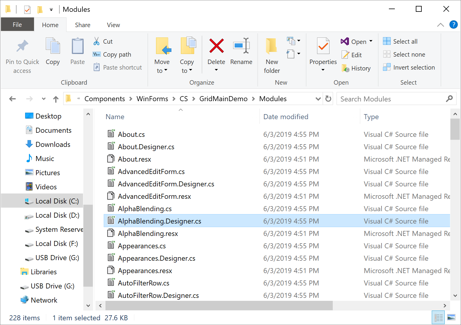
All demos are stored in the directory C:\Users\Public\Documents\DevExpress Demos xx.x\Components\WinForms. If you open one of the folders – here’s the Data Grid demo folder as an example – you’ll see all the modules included in the demo.

If you see a demo with a feature you’d like to implement in your own application, or some useful customization or design, you need to find the exact Visual Studio solution module that includes the relevant source code.
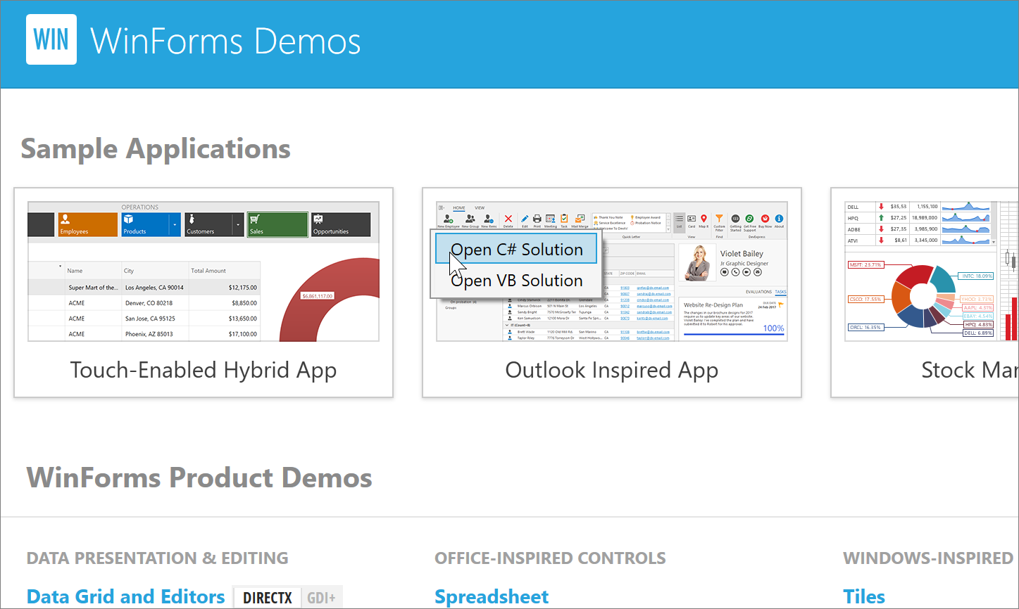
To make this easy, each demo in the Demo Center has an Open Solution button. Choose your preferred programming language and Visual Studio will open the demo module you’re currently looking at.

The same works for real-life demos, too – just right-click an item in the Demo Center.

It is also possible to copy links to demos. Our technical writers are main beneficiaries of this feature, when they insert these links into documentation or blog posts, so readers can run demos directly from the page they’re reading. However, you can also use these links to refer colleagues to a demo, or to include in a Support Center ticket.

A final item that deserves a mention is the Code Examples demo. This demo is available for our major controls and components and features small code samples that illustrate how to solve common tasks. You can also use the demo as a playground: just modify the code snippet, it recompiles when you stop typing, and the live preview reflects your changes.

Let’s Hear Your Thoughts
Hopefully you found something interesting in today’s selection. If you did, or if you recently discovered something really cool in the DevExpress suite and you think others might be unaware, please share it in the comment section below!
In addition, we’d like to ask a question. We recently published the rather lengthy post Mastering Filter Editors, and most of our Tips & Tricks posts are quite long as well. Do you like this format, or would you prefer it if we kept individual posts short and focused on one feature at a time?