Our upcoming v18.2 release brings changes to the way control background colors are handled in conjunction with skins.
In v18.1 we introduced the Project Settings page which includes a skin selector. This mechanism replaced most use cases of the DefaultLookAndFeel component. For many applications, applying a skin globally is the way to go – it’s easy to do and results in overall consistency.
However, most individual DevExpress WinForms controls also have their own LookAndFeel properties, which have been around for many years. The properties enable per-control configuration of skins and individual styles. Unfortunately this mechanism can be confusing to new users and there are few use cases where per-control settings make sense.
Colors to highlight UI elements
Why would you want to break design consistency and override global skin settings for individual controls? As far as we’re aware, there’s only one important scenario: highlighting specific UI elements using special colors. If you customize control LookAndFeel settings for reasons not covered by this use case, please feel free to let us know in the comments on this post, or by sending email to winformsteam@devexpress.com.
In the past, there was no straight-forward approach to apply highlight colors to UI elements. Custom background colors were only used when skinning was switched off for a control, and it took lots of conditional code to coordinate colors with runtime skin configuration.
Custom colors everywhere in v18.2
This is the first big news: starting with v18.2, you can now apply custom foreground and background colors without deactivating skins. To be clear, this means that the setting Appearance.BackColor is honored even when LookAndFeel.Style = DevExpress.LookAndFeel.LookAndFeelStyle.Skin– this combination of settings was ignored up to and including v18.1.
And it gets even better, because we also have…
Skin-coordinated highlight colors
You can now choose special values for control foreground and background colors, which are interpreted differently per skin.

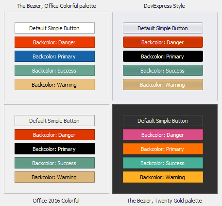
There are five special color values: Primary, Info, Warning, Danger and Success. Depending on the current skin (and palette, in case of vector skins), these colors use different hues to remain consistent with the skin.
By configuring colors of a control to these special values, you can easily achieve a highlighted appearance for the control that combines nicely with the current skin colors.

For example, to implement the appearance of this custom Edit Form, you would select the skin color Info for the background of the Update button and Danger for the Cancel button. Here’s an illustration of button appearance with these settings in different Bezier palettes.

Of course skin colors can also be assigned from code:
colId.AppearanceHeader.BackColor =
  DevExpress.LookAndFeel.DXSkinColors.FillColors.Question;
You can currently assign skin color special values as backgrounds for these UI elements:
- Grid Control: Column and Band headers, LayoutView and CardView card captions
- Simple Button
- Tabs
- Group Control
- Dock Panels
- Layout Control groups
- Tree List: Column and Band headers
Support for Pivot Grid column headers will be available by release time. Please let us know if you think we missed an important item here!
Skin color special values can be used for foreground colors without limitations. However, we recommend not to set background and foreground colors to skin color special values at the same time! When such values are assigned to background color properties, they automatically change related foreground color hues to improve readability.

Per-control LookAndFeel is deprecated
The LookAndFeel properties on individual controls are not needed anymore with the changes in v18.2. They will remain available for now, but we show a warning message in the editing dialog:

For future versions, we intend to hide the properties from design-time view.
A word of caution
There is one potential issue with the change detailed above: you may have configured Appearance.BackColor properties in the past while LookAndFeel.Style was set to Skin. Such setups could be leftovers from quick “tests” for look&feel configuration, or from previous UI styles that were superseded by skins. In such cases, you may see unexpected control background colors after upgrading the project to v18.2.
To help you find any such issues in your projects, we have extended our diagnostics API that is described on this page about DirectX. For many cases it will be helpful to set the PaintApiDiagnosticsLevel.Throw mode, like this:
DevExpress.XtraEditors.WindowsFormsSettings.ForcePaintApiDiagnostics(
  DevExpress.Utils.Diagnostics.PaintApiDiagnosticsLevel.Throw);
As a result you will see an exception thrown when a control renders a background color that is not a skinned color (i.e. not a DevExpress.LookAndFeel.DXSkinColors.FillColors value). This is the recommended approach, since it leads you quickly to the code location where the custom color is used.
Alternatively, or if you don’t like dealing with many individual exceptions, you can take advantage of the Trace mode to generate log output into a file or to the console:
WindowsFormsSettings.ForcePaintApiDiagnostics(PaintApiDiagnosticsLevel.Trace,
  (apiLevel, api) => {
    Console.WriteLine(apiLevel.ToString() + ": " + api);
  });
The api parameter of the lambda expression will contain a string like AppearanceHeader.BackColor. With this in hand, you can search your code for occurrences of each relevant property and evaluate how it is being set.
Your thoughts are always welcome
As always, we are very interested in your feedback. Are you looking forward to using the new features in your projects? Which other controls do you need to support background skin colors?