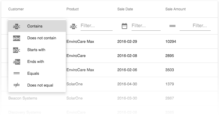
For the next release of the React Grid, we are currently finalizing some advanced filtering functionality. Of course filtering has been supported before— but this new feature set makes it much more convenient for the end-user!
What we’ve done
The grid will support a standard set of filter predicate types, and a UI for an end-user to apply those. Similar to our grids for other platforms, the functionality will be integrated in the filter row, providing a menu where filter criteria can be chosen per column:

Per-column restrictions
It will be possible to customize the available predicate types for individual columns. The DataTypeProvider will provide the new property availableFilterOperations for this purpose. This example restricts the predicate types for the amount column to a (random) selection of three:
<DataTypeProvider
  for={['amount']}
  availableFilterOperations={['equal', 'greaterThan', 'greaterThanOrEqual']}
/>
Custom predicates
Finally, you will also be able create custom predicate types, and to define the names and icons they use for the UI menu.

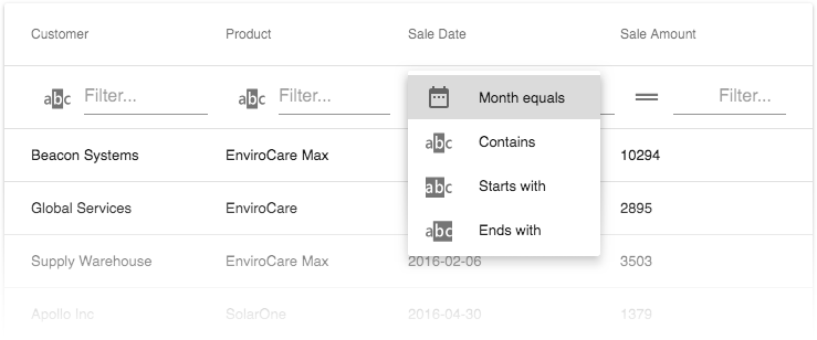
To illustrate this, here are the code snippets that add the month predicate to the list in the image. This is the custom icon:
const FilterIcon = ({ type, ...restProps }) => {
  if (type === 'month') return <DateRange {...restProps} />;
  return <TableFilterRow.Icon type={type} {...restProps} />;
};
Then there’s the implementation of the custom predicate itself:
const filteringColumnExtensions = [
  {
    columnName: 'saleDate',
    predicate: (value, filter, row, defaultPredicate) => {
      if (!filter.value.length) return true;
      if (filter && filter.operation === 'month') {
        const month = parseInt(value.split('-')[1], 10);
        return month === parseInt(filter.value, 10);
      }
      return defaultPredicate(value, filter, row);
    }
  }
];
And finally, the JSX code where the custom elements are integrated:
<DataTypeProvider
  for={['saleDate']}
  availableFilterOperations={['month', 'contains', 'startsWith', 'endsWith']}
/><IntegratedFiltering columnExtensions={filteringColumnExtensions} /><TableFilterRow
  iconComponent={FilterIcon}
  messages={{ month: 'Month equals' }}
/>
Do you have any thoughts?
We are currently finalizing our implementation of these new features, which will become available with our next release. At this stage, we’re very interested in any thoughts you might have, whether it’s on the feature set as such or our implementation specifically. Please feel free to comment below, or take part in the discussions on our GitHub page.
Join the Webinar
If you want to see all new features introduced in our v18.1 release, sign up for our upcoming “New in v18.1 - DevExtreme HTML / JS Controls” webinar where you’ll have a chance to ask questions as well.