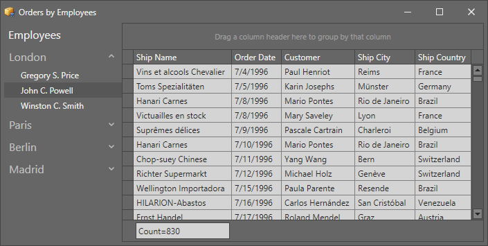
Our Accordion Control was released as a modern alternative to the trusty Navigation Bar. The control is still subject to constant improvement, and for our upcoming v18.1 release, we introduced support for the Navigation Pane view style that was previously supported by the Navigation Bar. The style is achieved by taking advantage of integration with the Office Navigation Bar.
Here is what the Accordion control looks like by default:

The Accordion leaves the display of its root items to the Office Navigation Bar, when the new integration is activated:

The Office Navigation Bar supports a Compact mode, like Microsoft Outlook:

With this mode active, the root items of the Accordion are shown as buttons at the bottom of the Accordion layout.

Activating the integration is very simple: just specify the property OfficeNavigationBar.NavigationClient:
<dxnav:OfficeNavigationBar NavigationClient="{Binding ElementName=accordion}"/><dxa:AccordionControl x:Name="accordion" CompactNavigation="True"><!-- ... --></dxa:AccordionControl>Finally, the Peek Form feature of the Office Navigation Bar lends itself well to the new Navigation Pane style. When the user hovers the mouse over a root item, the Peek Form pops up:

Note that a Peek Form template needs to be specified using the property AccordionItem.PeekFormTemplate. This allows you to easily implement your own Peek Form functionality.